Don’t Be Afraid of the Dark
Incorporating dark colors into your interior design
By Janna Zepp

The Modern Farmhouse Design trend shows no sign of slowing down anytime soon. That said, not all of us are wild about the whites, grays and beiges of the style, especially those of us with light sensitivity. I do love the rustic look and, until last year, I styled my kitchen in Classic Farmhouse for a while. Some 15 years ago, I had the de rigueur rooster and Holstein dairy cow motif, along with lots of red and white all over in line with the early incarnation of the style. I then transitioned to softer, muted colors, while keeping the farmhouse vibe. I loved it for quite a time, and I do enjoy the current MFH look in the homes of others.
All that brings me to the point of personal design: Brenda Esparza of Gallery Design Center, a wise and talented local interior designer with whom I am currently working to put a fresh face on my home, often reminds me that good design starts with that to which you, the homeowner, really gravitate. The purpose of an interior designer is to guide that love in the right direction to create a look that you will enjoy for a long time.
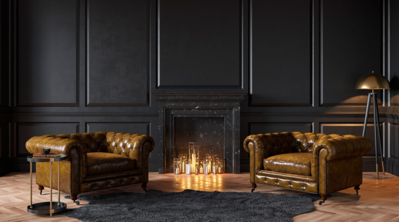
I absolutely love black. Dark colors draw me in. I love rich, dark, natural wood tones, stone floors and marble. Jewel tones such as plums, emerald greens, sapphire blues and deep reds mesmerize me. I love a sleek, sophisticated look mixed with antiques and treasures from the past. When Brenda and I set out to work together on creating a look for my home, I am certain she thought I was nuts. But she graciously corralled my avant garde tastes into a lush, yet neutral palette that combined dark wood, tile and marble against a warm white canvas for what is shaping up to be a gorgeous look.
To accent my love of color, I chose light fixtures and ceiling fans that are a nod back to the early 20th century Mission Style/Arts and Crafts Movement ala Charles Rennie Macintosh-style of colorful, stained glass with geometric shapes, as well as a bit of industrial Bauhaus style. All combined, the look balances the right amount of light and dark so that one does not overwhelm the other. And all of my late 19th/early 20th century inherited furniture pieces will look amazing in it once we are finished.
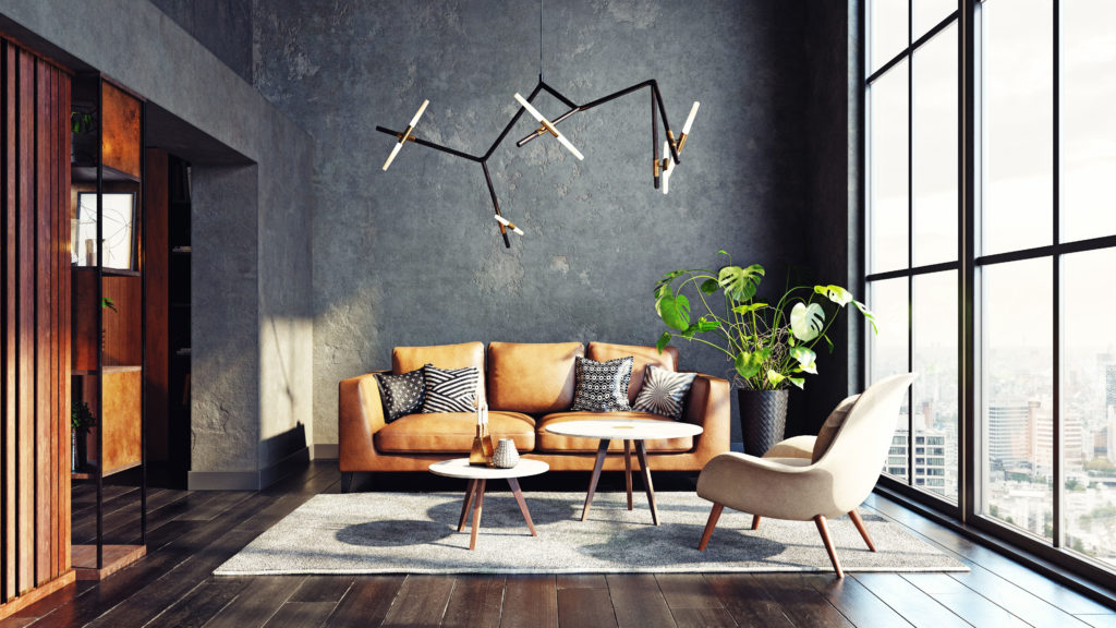
“Dark” does not always mean black, either. Any hue has a dark side worth embracing. Consider a dark color on the walls of a living room to contrast against light-colored furniture (wood or upholstery) to really make a statement. I like to think in terms of choosing one to three neutral colors and adding a fourth in a primary (red, yellow, blue) or secondary color (green, purple, orange) in varying shades, intensities, tints and values. The key to going dark well in your design is balance in color.
Before I began my interior design project, I created a Pinterest board to nail down my personal taste. It helped me focus when I met with Brenda to pick out everything we needed, and our design planning session took less than an hour to complete as a result. Be sure you have a definitive idea of the look you want when you go to work with a consultant.
Sometimes all that is needed to freshen up a look is a good coat of a quality paint applied by a professional painter. That is far less expensive than an entire home remodel. It also pays off tremendously to consult with a professional interior designer and contracting with one is not as expensive as you might think. Plus, if you choose materials that are not currently “on-trend,” you can end up saving more money than you realize.
So go ahead. Venture into the dark in your home design. You might find you had nothing to fear all along.
Terms to know
- Hue = color
- Value = light/dark
- Intensity = bright/dull
- Tint = lightened with white
- Shade = darkened with black

